

To make a pie chart in Google Sheets, select your data range, click Insert > Chart, then switch the chart type to “Pie chart” in the Chart Editor panel on the right. From there you can add percentage labels, apply 3D styling, and adjust colors, the whole process takes under two minutes once your data is formatted correctly.
That’s the short answer. Below is everything you need to actually get it right, including what usually goes wrong and how to fix it.
Prepare Your Data Before Inserting Anything
This step gets skipped constantly, and it’s why charts look broken. Your data needs exactly two columns: one for category labels and one for values. No merged cells, no blank rows inside the range, no header row that contains a number Google might try to plot. A clean setup looks like this:
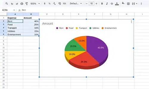
| Category | Value |
|---|---|
| Product A | 4200 |
| Product B | 3100 |
| Product C | 1800 |
| Product D | 900 |
If your values contain zeros, Google Sheets will include those slices, often as invisible slivers that confuse readers. Delete zero-value rows before creating the chart, or filter them out in a separate helper column.
How To Make a Pie Chart in Google Sheets: Step-by-Step
Step 1: Select Your Data Range
Click and drag to highlight both columns, including the header row. The header row tells the Chart Editor what to label each series.
Step 2: Insert the Chart
Go to Insert in the top menu bar and click Chart. Google Sheets will automatically generate a chart, but here’s the failure point most guides skip: it almost never defaults to a pie chart. It typically picks a bar or column chart based on your data structure.
Step 3: Switch to Pie Chart in Chart Editor
The Chart Editor panel opens on the right side of your screen. Under the Setup tab, click the Chart type dropdown. Scroll down to the “Pie” section and select Pie chart. Your data will immediately reformat into a circular chart.
If the Chart Editor doesn’t open automatically, double-click the chart to activate it, then it should appear.
Step 4: Verify Your Data Range
Still in the Setup tab, confirm the Data range field shows the correct cells. If slices look wrong, this is usually the culprit. Adjust the range manually if needed.
Step 5: Customize Labels, Colors, and Style
Click the Customize tab in Chart Editor. The key sections you’ll use:
| Section | What You Can Do |
|---|---|
| Chart style | Toggle 3D on or off, adjust background color |
| Pie chart | Control slice labels: value, percentage, label, or none |
| Slice | Change individual slice colors or explode a slice outward for emphasis |
| Legend | Reposition or hide the legend entirely |
Step 6: Move or Resize Your Chart
Click outside the Chart Editor to deselect it, then click once on the chart to select it as an object. Drag it to your preferred position on the sheet, or drag a corner handle to resize.
Pie Chart Label Options: Quick Comparison
Choosing the wrong label type is the second most common issue after wrong chart type selection.
| Label Type | What It Shows | Best Used When |
|---|---|---|
| Value | Raw numbers (e.g., 4200) | Audience needs exact figures |
| Percentage | Calculated % of total (e.g., 42%) | Showing proportions or share |
| Label | Category name only | Slices are already color-coded clearly |
| Label + Percentage | Both name and % | Presentations where legend isn’t visible |
| None | No text on slices | Chart paired with a separate data table |
To set your label type: Customize tab > Pie chart section > Slice label dropdown.
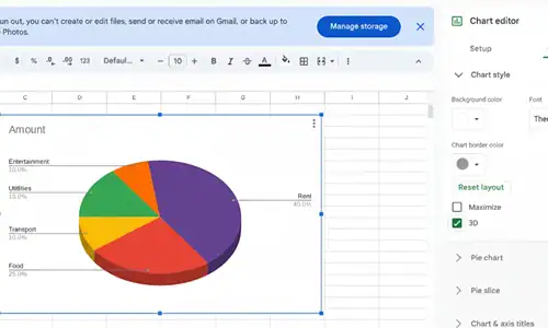
How To Create a 3D Pie Chart in Google Sheets
After you create your pie chart, open the Chart Editor, navigate to Customize > Chart style and select the 3D box. There is a shallow isometric depth effect re-rendered graph.
Because they’re in perspective, 3D pie charts can misleadingly distort the relative sizes of slices. Front slices appear larger than rear ones even when values are equal. For any audience that’ll be reading precise proportions, flat pie charts or a donut chart are more accurate visually.
How To Make a Donut Chart in Google Sheets
In the Chart type dropdown, you’ll see Donut chart listed directly below Pie chart. It uses the same data setup, displays the same percentage labels, and leaves a hollow center you can use for a total value or title.
When specialists need to show part-to-whole relationships in reports, donut charts tend to perform better because the empty center draws the eye to the proportions rather than each slice’s area.
Just like organizing information visually matters in Sheets, managing your digital tools efficiently carries over into everything, including knowing how to change your Gmail address without losing data when you’re setting up a cleaner workspace.
Pro Tips From Real Implementation
The auto-chart selection problem is permanent. Google Sheets will almost never auto-select pie chart for you. Build the habit of immediately going to Chart type in the Setup tab every single time.
Exploding a slice takes two clicks most people miss. In Customize > Slice, click the dropdown to select a specific slice by name, then drag the “Distance from center” slider. This isolates one category visually, which works well for highlighting a top-performing or underperforming segment.
Pie charts break with more than 6-7 categories. Once you exceed about six slices, the smaller ones become unreadable. Group anything under 5% of total into an “Other” category before charting, it’s a judgment call but one that consistently produces cleaner results.
Color accessibility matters. The default Google Sheets color palette uses red and green adjacent to each other. About 8% of men have red-green color vision deficiency. Swap to blues, oranges, and purples manually under Customize > Slice for any chart going into a public-facing report.
FAQs
How do I insert % in a pie chart in google sheets?
Can you create a 3D pie chart in Google Sheets?
How do we change the colors that are used in a pie chart in Google Sheets?
How to create a donut chart in Google Sheets?
Why does my pie chart not display all data on Google Sheets?
Can I explode a single slice in a Google Sheets pie chart?
Your Next Steps
If you’ve just built your first pie chart, try these next:
- Experiment with the donut chart variation, it uses identical steps and is often cleaner for slide decks
- Practice combining a pie chart with a small data table on the same sheet so viewers see both the visual and exact numbers
- Explore Google Sheets’ Sparkline function for inline mini-charts inside individual cells, a powerful complement to full charts for dashboards
For deeper work with Google Sheets charts, Google’s official Google Workspace Learning Center covers advanced chart types including geo charts and scatter plots. The Google Sheets function reference is also the most reliable reference for keeping up with any feature changes.
If you document your data workflows and share findings with a team, it’s also worth knowing how to copy Instagram comments when you’re pulling social data into a reporting sheet, a small but useful trick for content and marketing teams.
Related topics worth exploring next: how to make a bar chart in Google Sheets, how to use conditional formatting to highlight data before charting, and how to link Google Sheets charts directly into Google Slides for auto-updating presentations.